My Role: UI/UX designer & researcher
Timeline: 6 months (February - July 2021)
UI/UX Deliverables: Flowcharts, Sketches, User Personas, Empathy Maps, Sitemaps, Wireframes, and Prototypes.
Tools Used: Sketch, Marvel App, InVision
Problem
Living in a large city, it’s challenging to find other passionate bakers.
Spurred by the Covid-19 pandemic, and an evolving world, people have themselves home more than ever before. To maintain a sense of normalcy and to continue to form new relationships, many have turned to baking for their family, friends, and neighbors.
“Cooking brings us together, and it continues to create communities - and with community comes feelings of connection and happiness.”
- Julie R. Thomson “The Very Real Psychological Benefits Of Cooking For Other People” - Huffpost.com
“How might we connect bakers through shared food experiences?”
Solution
Create a mobile app for bakers to bond via creative expression.
• Includes an image-based UI
• Easy search functionality for niche users
• Simple design to promote glanceable and capturable usage


Research
I worked solo on the creation of the Merrymaking mobile app while earning my UI/UX Design Certificate. While conducting extensive secondary research, I surveyed 20 people to find out if they’d be appropriate for an interview. In order to fit into the interview needs, the users had to both utilize a smartphone and enjoy baking as a hobby.
User Interviews
I interviewed the five found users, ages 30-65, all of whom search for recipes online and enjoy baking. I gained many insightful pieces of information that were necessary to build the Merrymaking app. I asked them questions pertaining to how they feel when they bake, if they face challenges while finding recipes online, and what memories appear while thinking about baking.
Empathy Map
Helped to break down the behaviors and attitudes of the users.


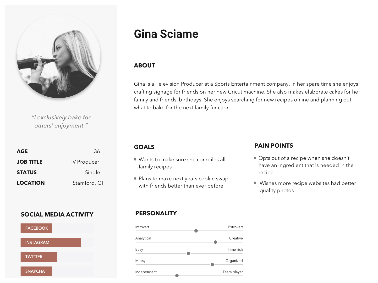
Personas
Creating a Persona further helped in understanding who my key audience was.
Sketching Begins…
During this part of the ideation process, I like to use pencil and paper in order to quickly get all of the basic ideas down first, then refine over and over from there. I always keep in mind: who the target user is and what their motivations will be.

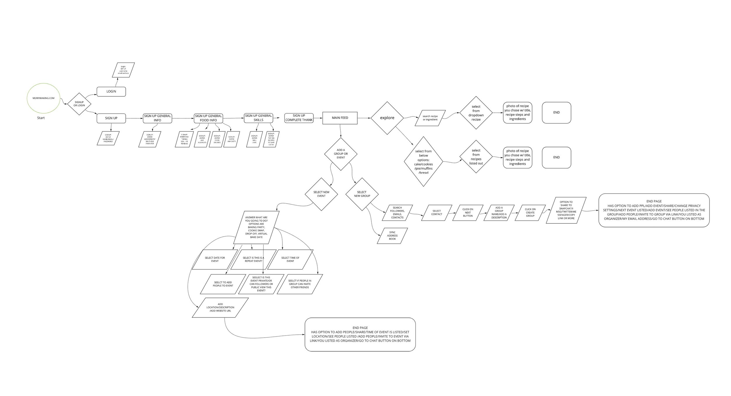
Merrymaking User Flow
The user flows helped me understand and communicate the user’s goals.
Wireframes
The wireframes helped to create divergent ideas based on the early sketches.

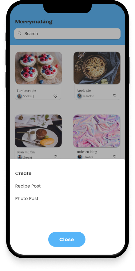
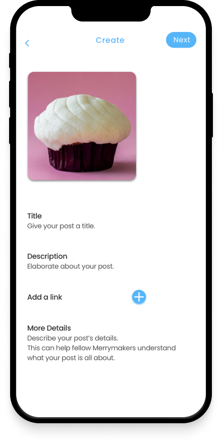
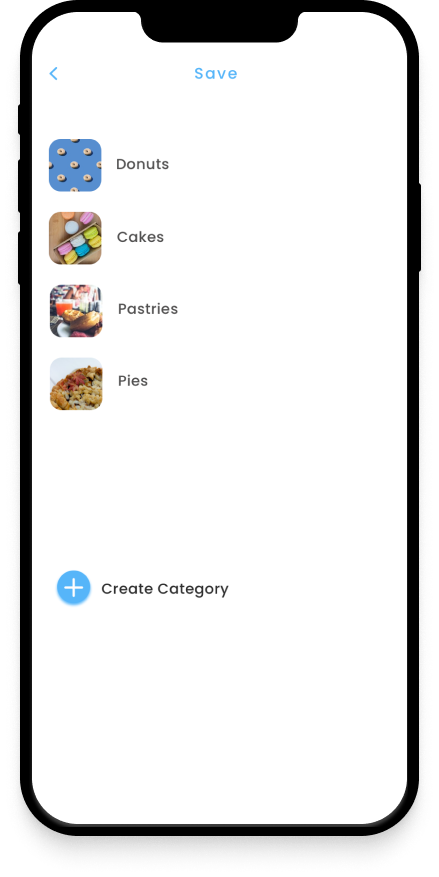
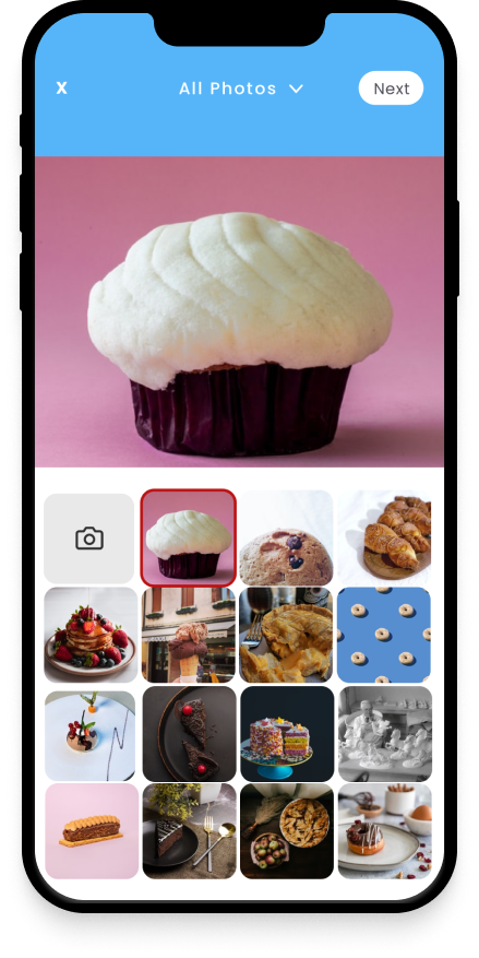
Prototypes
Because I was enabled the time, I tested the prototypes often via the guerrilla usability testing method. I was searching for insights into the learnability, efficiency, and satisfaction of the app. I did revisions often after the testing: below is an early round of prototypes that I designed. This round proved to be too colorful and still not modern enough for my target audience. I removed some of the uneccesary screens and ended up refining the logo.

Final Home Screen to Test

Final “How to Create a Post” Screens